
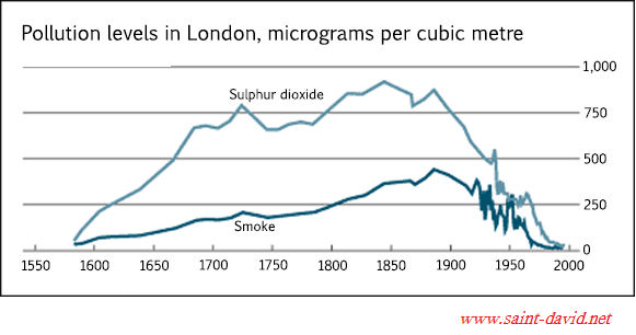
The given line graph illustrates the
level
of contamination in London measured by Use synonyms
micrograms
per cubic Use synonyms
meter
over the course of 400 years starting in 1600.
Looking at the graph, it is immediately obvious that both pollutants have experienced dramatic variation throughout the time frame. Use synonyms
Overall
, the amount of Sulphur dioxide emitted always appeared to be higher compared to the proportion of smoke.
In 1600, the Linking Words
level
of pollution was relatively low, but in the Use synonyms
next
hundred years, London witnessed a sudden increase in both contaminated gas with Sulphur dioxide skyrocketed to 700 Linking Words
micrograms
per cubic Use synonyms
meter
, Use synonyms
while
the Linking Words
level
of smoke slightly increased to about 200 Use synonyms
micrograms
per cubic Use synonyms
meter
. Over the Use synonyms
next
two centuries, Linking Words
Sulphur
dioxide emission rate continued to increase and managed to reach a peak at roughly 900 Correct article usage
the Sulphur
micrograms
per cubic Use synonyms
meter
in 1850 despite some fluctuations in Use synonyms
this
period. In the meanwhile, the Linking Words
level
of smoke Use synonyms
also
experienced a gradual growth and reached the highest figure at approximately 500 Linking Words
micrograms
per cubic Use synonyms
meter
around 1900. In the Use synonyms
next
ten decades, Linking Words
however
, both pollutants fluctuated dramatically and eventually plunge to the bottom with zero Linking Words
micrograms
per cubic Use synonyms
meter
registered.Use synonyms