
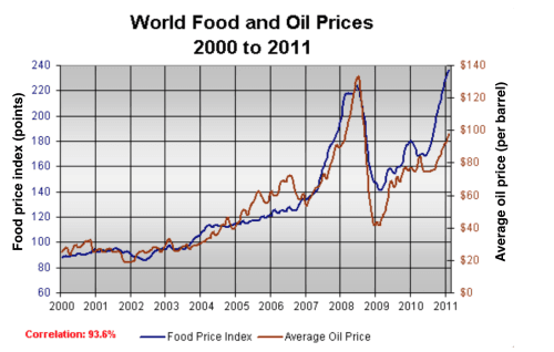
The line graph compares the average
price
of a Use synonyms
barrel
of Use synonyms
oil
with the Use synonyms
food
Use synonyms
price
Use synonyms
index
over a period of 11 years.
Use synonyms
It is clear that
average global Linking Words
prices
of Use synonyms
both
Use synonyms
oil
and Use synonyms
food
rose considerably between 2000 and 2011. Use synonyms
Furthermore
, the trends for Linking Words
both
commodities were very similar, and so a strong correlation (93.6%) is indicated.
In the year 2000, the average global Use synonyms
oil
Use synonyms
price
was close to 25 Use synonyms
dollars
per Use synonyms
barrel
, and the Use synonyms
food
Use synonyms
price
Use synonyms
index
stood at just under 90 Use synonyms
points
. Over the following four Use synonyms
years
Add a comma
years,
both
Use synonyms
prices
remained relatively stable, before rising steadily (sürekli) between 2004 and 2007. By 2007, the average Use synonyms
oil
Use synonyms
price
had almost doubled, to nearly 60 Use synonyms
dollars
per Use synonyms
barrel
and Use synonyms
food
Use synonyms
prices
had risen by around 50 Use synonyms
points
.
A dramatic increase in Use synonyms
both
commodity Use synonyms
prices
was seen from 2007 to 2008, with Use synonyms
oil
Use synonyms
prices
reaching a peak of approximately 130 Use synonyms
dollars
per Use synonyms
barrel
and the Use synonyms
food
Use synonyms
price
Use synonyms
index
rising to 220 Use synonyms
points
. Use synonyms
However
, by the beginning of Linking Words
2009
the Add a comma
2009,
price
of Use synonyms
oil
had dropped by roughly 90 Use synonyms
dollars
, and the Use synonyms
food
Use synonyms
price
Use synonyms
index
was down by about 80 Use synonyms
points
. Use synonyms
Finally
, in 2011, the average Linking Words
oil
Use synonyms
price
rose once again, to nearly 100 Use synonyms
dollars
per Use synonyms
barrel
, Use synonyms
while
the Linking Words
food
Use synonyms
price
Use synonyms
index
reached its peak, at almost 240 Use synonyms
points
.Use synonyms