
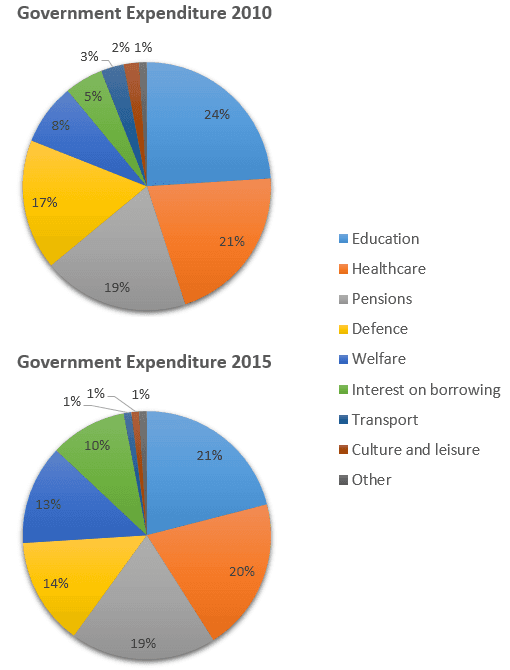
The pie charts illustrate the proportion of money spent on various government expenses in the period 2010-2015. In general, education, healthcare,
pensions
were the main expenses, but defence, welfare, interest on borrowing, transport, culture and leisure and others took up a smaller proportion during the given years.
Correct word choice
and pensions
In contrast
, the greatest single expense was education at 24% in 2010, compared with 21%Linking Words
at the end
of the year.Health care came in Linking Words
second
place at 21% by the year 2010, Linking Words
while
the actual proportion was lower at 20% in Linking Words
the
2015. Another major expense wasChange the article
apply
pensioned
, it showed unchanged numbers at 19% over Replace the word
pension
this
five-year period.
Linking Words
According to
the rest of the portion, Linking Words
its
obvious that they have demonstrated Replace the word
it's
it is
lower
percentage from 17% to 1% in 2010-2015.Correct article usage
a lower
For instance
: defence (17%-14%), welfare (8%-13%), interest on borrowing (5%-10%), transport (3%-1%), culture and leisure (2%-1%), other (1%-1%) during the covered period 2010-2015Linking Words