
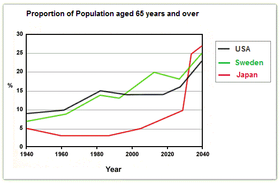
The line graph illustrates the percentages of people in age 65 and over in three different countries from 1940 to 2040.
Overall
, the proportion of Linking Words
Japan
was by far the lowest until 2020; meanwhile, three countries observed upward trends in life expectancy over the period surveyed.
A similar pattern was reported for Sweden and the USA with a steady rise of roughly 5%, Use synonyms
whereas
, the figure for Linking Words
Japan
decrease slightly to 3% from 1940 to 1980. Use synonyms
At the end
of the 1990s, the proportion of Sweden overtook that of the USA; meanwhile, that of Linking Words
Japan
rose slightly to 5% in 2000.
When the period 2000-2010 witnessed a stable trend in the growth of the USA’s Use synonyms
life time
, Correct your spelling
lifetime
Japan
and Sweden grew dramatically Use synonyms
by contrast
. By the end of 2040, Linking Words
Japan
’s proportion will have increased significantly and overtook the others to become the highest among the three countries surveyed.Use synonyms