
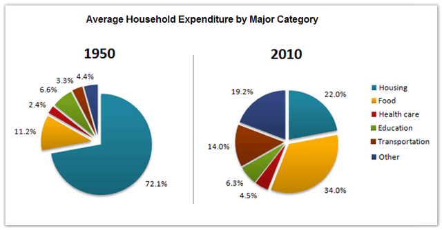
The spending of
average
family in a country on main sectors in the Add an article
the average
an average
year
1950 and 2010 Fix the agreement mistake
years
is
compared in two pie charts.
It is clear from the charts that the percentage of expenditure on health care was by far Change the verb form
are
lowest
during the research period. Correct article usage
the lowest
Additionally
, the Linking Words
figure
for housing experienced the most noticeable change.
In 1950, the proportion of spending on housing was highest, at 72,1%, Use synonyms
while
the Linking Words
figure
for food was significantly lower, at only 11,2%. Meanwhile, expenditures on Use synonyms
transport
and other categories made up 3,3% and 4,4% of the total money paid respectively. The rate of money spent on health care was lower than other sectors, at 2,4%, compared to 6,6% of spending on education.
In 2010, the percentage of expenditure spent on food dramatically rose by around 22% to 34,0% and became the highest Add an article
the transport
figure
in the chart. At the same time, there were significant increases in the proportions of money used for transportation and other items to 14,0% and 19,2% respectively. Use synonyms
By contrast
, the year 2010 witnessed a remarkable decline of about 5% to 22,0% in the Linking Words
figure
for housing.Use synonyms