
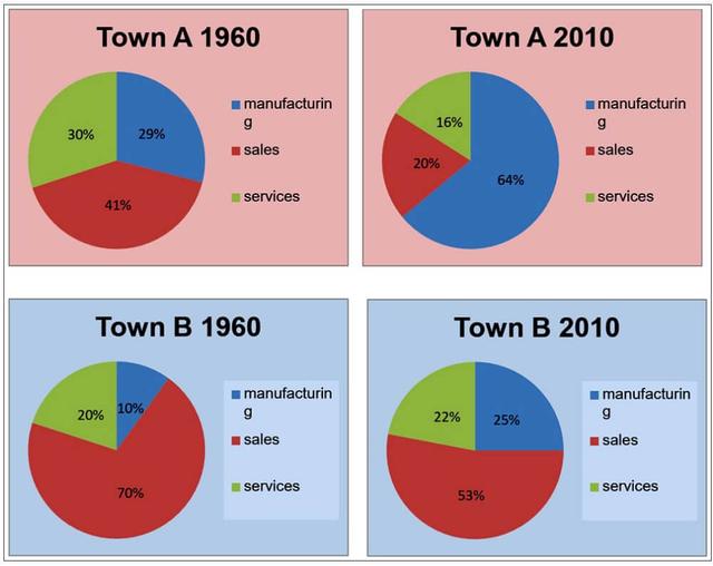
The pie charts compare the
proportion
of the working population in manufacturing, Use synonyms
sales
and services in 1960 and 2010 in two Use synonyms
towns
.
Use synonyms
Overall
, the percentage of the workforce in manufacturing increased in both Linking Words
towns
in 2010 compared with the 1960 figures. Use synonyms
By contrast
, in Linking Words
Towns
A and Use synonyms
B
, the Use synonyms
proportion
of those working in the Use synonyms
sales
sector fell in 2010.
In 1960, the figure for workers in manufacturing was 29% in Use synonyms
Town
A, almost three times higher than the figure in Use synonyms
Town
Use synonyms
B
. Use synonyms
However
, by 2010 the Linking Words
proportion
of people in manufacturing had risen in Use synonyms
Towns
A and Use synonyms
B
to 64% and 25%, respectively.
Use synonyms
On the other hand
, the figures for the Linking Words
sales
sector witnessed a decline. In Use synonyms
Town
A, the Use synonyms
proportion
of the workforce in Use synonyms
sales
in 1960 was 41% and Use synonyms
this
fell by over half to 20% in 2010. In Linking Words
Town
Use synonyms
B
, the figure decreased from 70% in 1960 to 53% in 2010.
The percentage of workers in the services sector almost halved in Use synonyms
Town
A to 16% in 2010, Use synonyms
whereas
in Linking Words
Town
Use synonyms
B
it rose slightly from 20% in 1960 to 22% in 2010.Use synonyms