
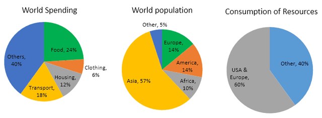
The pie chart compares data on the expenditures and exhaustion of food, housing, transport and other
resources
by different nations of the world and Use synonyms
also
the distribution of population. Units are measured in percentage.
Linking Words
Overall
, it can be noted that Asia has the highest population compared to Africa, America and Linking Words
Europe
, Use synonyms
whereas
other countries are the least populated. Linking Words
On the other hand
, most nations spent more money on other Linking Words
resources
but the USA and Use synonyms
Europe
consumed more than half the percentage of the Use synonyms
resources
than others.
Use synonyms
To begin
with, 57% of the world's population are Asians which is the highest populated country, Linking Words
while
others accounted for just 5%. America and Linking Words
Europe
had the same proportion of populace which is 14% respectively, Use synonyms
in contrast
to Africa which made up only one-tenth of the total number.
Linking Words
Furthermore
, the global expenses were seen more on other Linking Words
resources
which stood at 40%, Use synonyms
then
24% and 18% of the global budget went on food and transport. The least spending was on housing 12% and clothing 6%. Linking Words
Also
, the USA and Linking Words
Europe
utilized about two-thirds of the Use synonyms
resources
Use synonyms
while
other countries exhausted 40% of their Linking Words
resources
.Use synonyms