
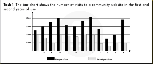
The graph compares the frequency of visiting community sites during the first and second years since it has been introduced.
Overall
, the number of second-year attendees outweighs the first-year ones with only August being an exception.
Looking into details, both figures started off from less than 5000 in September, rising dramatically to the point of 10000 in November for new users and 17500 for regular ones. Linking Words
Then
, statistics levelled off for 2 months, though in January the numbers dropped slightly for experienced visitors and plummeted for others ( 16000 and almost 0). Linking Words
However
,in February and March the decrease stoppedpped and ,Linking Words
following
Linking Words
this
, in April people started to visit the web pages and figures increased significantly for both groups of users( 1250 and 2250 correspondingly). Despite Linking Words
this
growth, in August numbers went down again ( 1500 and 1250 respectively).
Linking Words
To sum up
all of the above, both categories followed a similar pattern throughout the year.Linking Words