
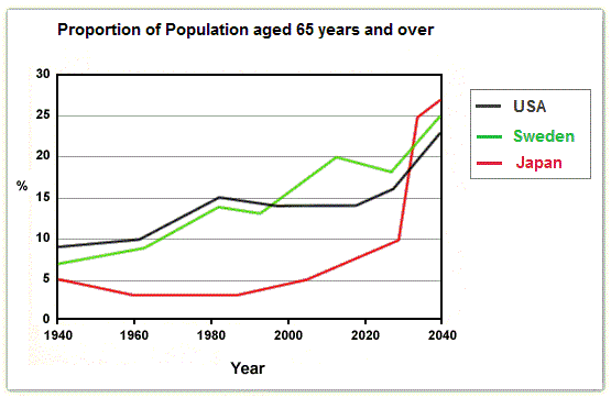
The graph illustrates the percentage of the eldest aged 65 and over in three countries, Japan, the USA, and Sweden, between 1940 and 2040.
Overall
, the population of old people in all three countries is increasing in trend during the period with the peaks have been over 20%.
Linking Words
To begin
with, the population of the eldest in Japan has slightly increased for 80 years starting from 1940. It moves from 5% to 10% in 2030, followed by a rocket for the next 10 years to 27%. Linking Words
However
, the growth of old people in the USA rose from 1940 to 1980 and remained stable at 14% for the next 20 years. Linking Words
Then
, it has risen significantly to over 20% in 2040.
Turning to the Linking Words
last
country, Sweden. Starting around 7% in 1940, the composition of people aged 65 and over in that country has gone up gradually and hit the top 25% in 2040.Linking Words