
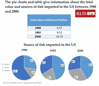
The table below shows the value of fish that was imported to the US (measured in billions of dollars) in 1988,1992 and 2000,
while
the three pie charts illustrate the amount of fish that the US brought in from China,Linking Words
Canada
and other Use synonyms
countries
in the same three years.
Use synonyms
Overall
,the value of Linking Words
imports
rose by just under double over the period given.At the start of the period,the US imported predominantly from Use synonyms
Canada
but,by 1992 other Use synonyms
countries
became the main source.
Regarding the table,the value of Use synonyms
imports
started at $6.57 billion in the first year,increasing to $8.52 in 1992 and reaching $10.72 in the Use synonyms
last
year.
In terms of the source of fish importation,Linking Words
Canada
supplied the overwhelming majority in 1998 (60%) compared to China and other Use synonyms
countries
which provided only 13% and 27% respectively.The Use synonyms
imports
from Use synonyms
Use synonyms
canada
Change the capitalization
Canada
then
proceeded to fall to 28% in the final year.Linking Words
Conversely
,by 1992,other Linking Words
countries
had replaced Use synonyms
Canada
as the main supplier and made up 46% of all Use synonyms
imports
in 1992 and 42% by 2000.Use synonyms
Likewise
,Linking Words
imports
from China rose over the period to reach 30% in 2000.Use synonyms