
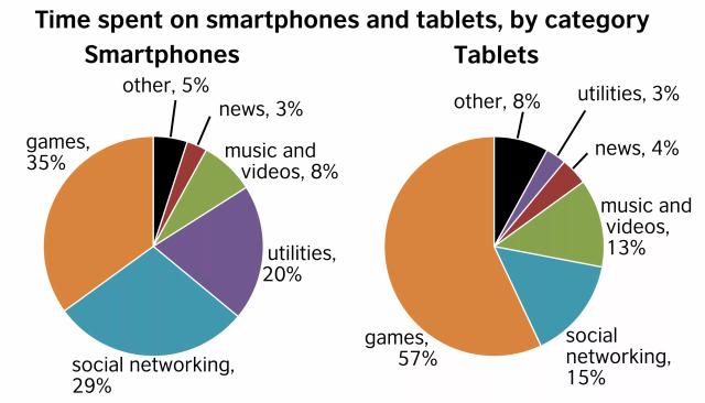
The given pie charts demonstrate the proportion of time people their
smartphones
and Use synonyms
tablets
for six different aspects, namely: games, news, music and videos, social networking and other.
Use synonyms
Overall
, it can be clearly seen that games are the most used category on both Linking Words
smartphones
and Use synonyms
tablets
.
Looking at the figures in detail, games have the highest percentage of usage with 35% on Use synonyms
smartphones
and 57% on Use synonyms
tablets
. Use synonyms
Also
, people spent 29% on Linking Words
smartphones
and 15% on Use synonyms
tablets
using social networks, which comes in the second proportion of the most used category.
Use synonyms
Furthermore
, utilities are the third most used aspect on Linking Words
smartphones
by 20%. Use synonyms
In contrast
, people who use Linking Words
tablets
spent only 30% of their time using them. In regards to news, users almost equally do not check it a lot with 3-4% on Use synonyms
smartphones
and Use synonyms
tablets
.Use synonyms