
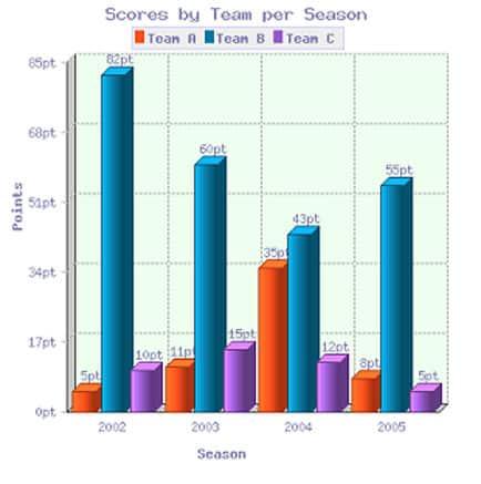
The bar chart illustrates the
points
earned by three different Use synonyms
teams
, Use synonyms
teams
A, Use synonyms
B
and C, in four consecutive seasons from 2002 to 2005. It is evident that Use synonyms
team
Use synonyms
B
scored by far the most in every season, Use synonyms
while
Linking Words
team
A got minor Use synonyms
points
in total.
In 2002, Use synonyms
while
Linking Words
team
Use synonyms
B
scored 82 Use synonyms
points
, the highest of all time in 4 seasons, Use synonyms
teams
A and C got only a few Use synonyms
points
(5 and 10, respectively). The Use synonyms
score
of Use synonyms
team
Use synonyms
B
fell to 60 in 2003, and Use synonyms
teams
A and C experienced a tiny increase, Use synonyms
although
they remained far lower than Linking Words
team
Use synonyms
B
.
There was significant growth in Use synonyms
team
A’s Use synonyms
score
in 2004, to 35 Use synonyms
points
, seven times higher than in 2002. Use synonyms
On the other hand
, Linking Words
team
Use synonyms
B
’s Use synonyms
score
again noticeably decreased by 17 Use synonyms
points
at the same time, Use synonyms
whereas
Linking Words
team
C’s Use synonyms
score
marginally fell by 3 Use synonyms
points
. Use synonyms
However
, the season of 2005 was a turnover, when Linking Words
team
Use synonyms
B
’s Use synonyms
score
rocketed to 55 Use synonyms
points
, Use synonyms
team
A’s Use synonyms
score
markedly fell back to 8 Use synonyms
points
, and Use synonyms
team
C’s Use synonyms
score
declined to 5. Anyhow, Use synonyms
team
Use synonyms
B
got by far the most Use synonyms
points
among the three Use synonyms
teams
in every season.Use synonyms