
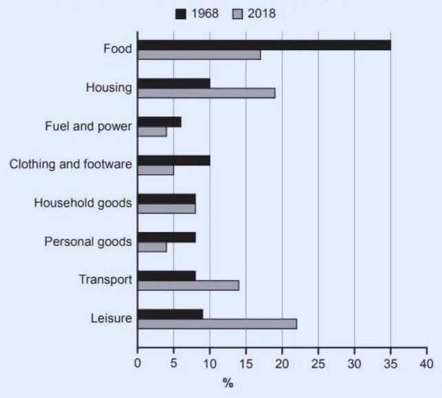
The bar chart illustrates the proportion of family weekly
expenditure
in a particular nation in 1968 and 2018.
Use synonyms
Overall
, the average family Linking Words
expenditure
had significantly changed over the 50 years. Another interesting point is that spending on Use synonyms
food
was the highest expense in 1968, Use synonyms
whereas
in 2018, leisure had the majority of the family budget in weekly spending, followed closely by housing.
In 1968, families spent 35% of their weekly income on Linking Words
food
which was the highest Use synonyms
expenditure
compared to other budgetary concerns; each of any categories showed between 5% and 10%. Use synonyms
On the other hand
, fuel and power were the lowest at 6%.
By 2018, the Linking Words
expenditure
on Use synonyms
food
had dropped considerably from 35% to around 16%, Use synonyms
while
leisure had become more critical Linking Words
on
families’ income and spent on leisure rose more than 20%, followed by housing and Change preposition
to
food
, at 19% and 17% respectively. When people’s usage of clothing and foot ware doubled to roughly 14% from 7%, the weekly spending on household goods remained unchanged in both periods.Use synonyms