
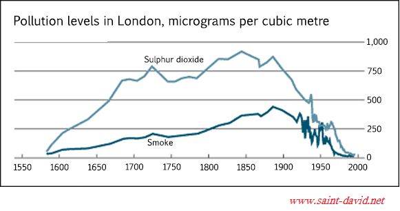
The line chart illustrates micrograms per cubic metre of pollution in the UK from 1600 to 2000.
Overall
, there were two peaks of sulphur dioxide activity Linking Words
over all
Correct your spelling
overall
period
. Use synonyms
However
, the most harmful Linking Words
period
for smoking was almost int the end of the recorded time.
Sulphur dioxide pollution grew dramatically between 1600 and 1725 when it reached a peak at approximately 750 units. After that was a short Use synonyms
period
of decline until 1775, Use synonyms
then
the level increased steadily and reached the second high point at almost 900 micrograms per cubic metre in 1850. During the Linking Words
last
150 Linking Words
years
the line shew a significant decrease to almost zero in 2000.
Smoking pollution had the same trend but with lower numbers. There was a relative growth from 1600 to 1870 when it reached a peak at over 450 units. Later we can see a Add a comma
,years
period
of dropping with high fluctuation between 1925 and 1960. Use synonyms
In addition
, the harmful level fell to a zero mark in 2000.Linking Words