
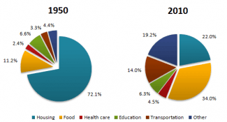
The diagrams represent the average proportion of the amount of money which was spent on various family needs in France and how it changed from 1950 to 2010.
Overall
, it is indicated that the percentage of capital spending on housing decreased significantly from 1950 to 2010.
Linking Words
To begin
with, spending for each household on food, other and transportation categories rose. At the same time, there was only a slight change in the percentage of cash spent on education and health care between 1950 and 2010. Linking Words
Moreover
, Spending in the housing category, which made up approximately three quarters in 1950, fell sharply to form only nearly one-fifth of the total expenses in 2010. Linking Words
Also
, the food section, which Linking Words
also
had a significant change, went up to 34% in 2010 from a little over one-tenth in 1950. Linking Words
Similarly
, the money spent on other needs and transportation had an upward from less than 5% each to 19.2% and 14%, respectively. The education and healthcare categories had a small change.
Linking Words
To conclude
, the healthcare category, which made up 2.4% in 1950, had a 2.1% increase. So, the education category, which was Linking Words
initially
6.6% of total spending in 1950, had just a 0.3% decrease.Linking Words