
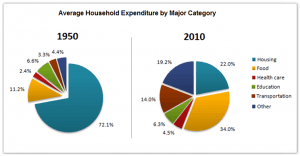
The pie diagram illustrates the percentages of household purchases,which were made between 1950 and 2010.
Overall
,Linking Words
it is clear that
in 1950 the highest per cent had "Housing"(72.1%),Linking Words
while
in 2010 the leading section was "Food" with 34%.Linking Words
Besides
in ,1950 all the aspects had a number lower than 10,except "Food",Linking Words
while
60 years later only two sections had numbers less than ten( "Education" and the "Transportation")
Linking Words
Firstly
,in 1950 "Housing "with 72.1% was the leader,Linking Words
however
,in the next ,chart its per cent significantly dropped to 22.All other parts in the first diagram had miserable numbers,Linking Words
however
, in 2010 grew.Linking Words
Secondly
,in 60 years the "Food" purchases surged from 11.2% to 34%,which made it the biggest increase of the two diagrams.The second place of growth had the "Other" section,which rose from 4.4% to 19.2%.Linking Words
However
,not all the aspects changed notably.The "Health care" grew only 2.1%.Linking Words
Moreover
,the only section which decreased in that period is "Education".Its per cent gently declined from 6.6% to 6.3%Linking Words