
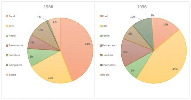
The pie charts demonstrate the American people's way of utilizing
money
from 1966 to 1996.
As illustrated by the 1966 graphic, the highest Use synonyms
money
was spent on foodstuffs 44%. It was followed by cars with a difference of 21%. Spending on fuel was 9%. Restaurants and books had expenditures of 7% and 6% respectively. People used one-tenth of their Use synonyms
money
on furniture, Use synonyms
whereas
a mere 1% of the usage was observed for computers.
Turning towards the year 1996, expenditure on food Linking Words
was
decreased significantly to 14%, Unnecessary verb
apply
while
spending Linking Words
was
increased considerably on cars to 45%. The percentage of restaurant expenditure doubles after three decades. Unnecessary verb
apply
Money
laid out on petrol remained almost intact. A minor 2% downfall was observed in furniture spending. Computers Use synonyms
money
utilization increased ten times than previous year. Use synonyms
However
, books showed a reverse trend as they declined to 1%.
Linking Words
Overall
, people's Linking Words
money
layout preference increased substantially for cars Use synonyms
along with
restaurants. Linking Words
Conversely
, spending on food dropped highly.Linking Words