
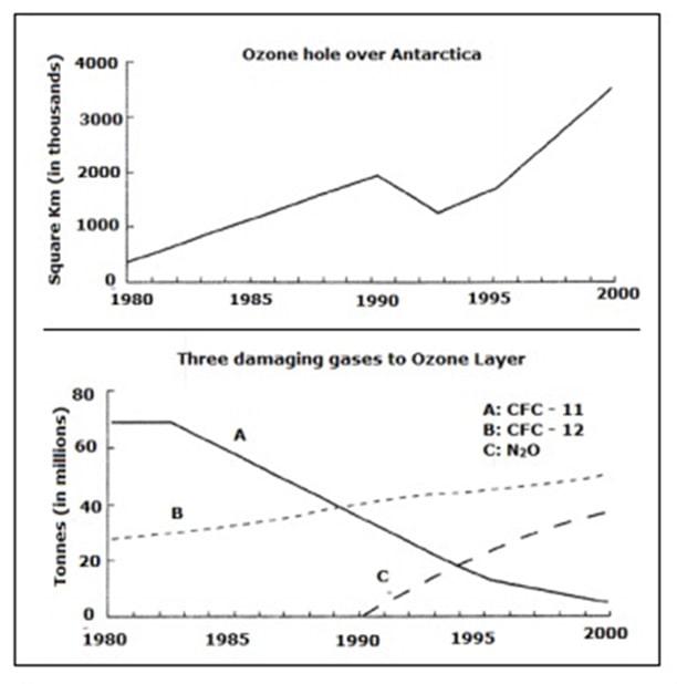
To begin
, the line graphs provide information on how the size of the ozone hole in Square Km (in thousands) over Antarctica changed over a 20-year period of Linking Words
time
and the amount of ozone-damaging gases released in Tonnes (in millions) during the same Use synonyms
time
.
Use synonyms
Firstly
, the size of the hole increased significantly from 1980 to up until 1990 showing a value of approximately 2,000,000 Square Km even though, around 1993 a considerable decline in the trend can be observed. Linking Words
Furthermore
, until 2000 the size of the hole had gotten bigger when it peaked at 4,000,000Sq.Km Linking Words
giving
the largest number in that duration of 20 years.
The second graph outlines how much of the three main ozone-damaging gases were released in the above-mentioned Wrong verb form
gives
time
range. CFC-11 was at its peak back in 1980 emitting around 70 million Tonnes Use synonyms
while
20 years later it shows a decreasing trend continuously Linking Words
while
CFC-12 illustrates the opposite of that growing gradually overtime within the Linking Words
time
frame.N2O started producing back in 1990 unlike the other two gases and it Use synonyms
also
shows a growth.Linking Words