
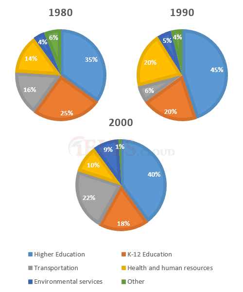
The pie chart illustrates the percentage of changes in annual
expenditure
by local officials in Someland in 1980, 1990 and 2000.
Use synonyms
Overall
, In all three years, the greatest Linking Words
expenditure
was on Use synonyms
education
. But Use synonyms
while
K-12 Linking Words
education
saw a fall from 25% in 1980 to only 18% of spending in 2000, higher Use synonyms
education
remained the largest proportion, reaching 45% of total spending in 1990 and ending at 40% in 2000.
Use synonyms
Firstly
, 35% of total money was spent on the higher Linking Words
education
service in 1980, which rose to 45% in 1990, but saw a decline in 2000 and the number was 40%. After that comes the K-12 Use synonyms
education
sector and 25% of Use synonyms
expenditure
were made in 1980, Use synonyms
whereas
20% of total money was budgeted in 1990 and it was only 18% in 2000. In the transportation field, 16%, 6% and 22% of total money were used to make changes in the years 1980, 1990 and 2000 respectively.
Linking Words
However
, the in-charge authority spent 14% on the health and human resources service in 1980, which was 6% higher in 1990 and in 2000 it was 4% less. Linking Words
Furthermore
, the Linking Words
expenditure
on environmental services was 4%, 5% and 9% respectively, which is very less compared to other fields. Use synonyms
Finally
, in other sectors, the percentage witnessed some decrease over the years from 6% to 4% and only 1% remained in the Linking Words
last
given period.Linking Words