
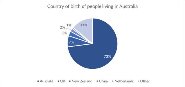
The pie chart provided reveals the country of birth of people living in
Australia
and the table illustrates where people born in these countries live.
Use synonyms
Overall
, Linking Words
Australia
’s population is mostly made up of people born in Use synonyms
this
country and most of them live in cities. The following regions Linking Words
such
as the UK, New Zealand, China, Netherlands and others all have low percentages of communities born in Linking Words
Australia
that live there but a high rate of society who live in urban areas.
It can be concluded from the pie chart that Use synonyms
Australia
is approximately 10 times greater than the UK and 5 times greater than the other states. The community of the country has a lot of ethnicities, with Use synonyms
Australia
and the UK having high rates and other countries like New Zealand, Netherlands, China and other countries with a much lower count.
Use synonyms
Besides
that, the table shows that Linking Words
Australia
has a very high population density in cities. With a high estimate of crowd born in Use synonyms
Australia
, it is Use synonyms
also
detected that 83% of them live in urban and 17% live in rural areas. Meanwhile, China has the lower count of the population born in Linking Words
Australia
at a rate of 2% but surprisingly, it has the highest percentage of families living in cities at 99%, almost an absolute number and only 1% of Chinese live in rural areas.Use synonyms