
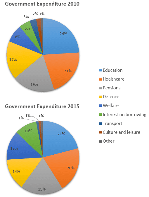
The given charts depict local bureaucratic spending for several sectors in 2010 and 2015
In 2010, the education sector was the most local expenditure budgeted by the government with a percentage of 24%, and slightly similar to Healthcare at 21% as the second position.
Next,
the Defence and Pensions have allocated just under 20%. Linking Words
Furthermore
, the rest showed sectors Linking Words
such
as Transportation, Interest borrowing, and others have expended just under 10%.
Compared with 2015, Education was considerably still the most expenditure by local government but has slightly declined to 3%. Unless Linking Words
Pension
outlay was relatively similar to the previous period. Correct article usage
the Pension
Furthermore
, Transportation and Interesr borrowing sharply increased around doubling. Since culture and leisure and others were the least bureaucratic spending of local government in 2010, in 2015 their position was relatively similar to the previous year.Linking Words