
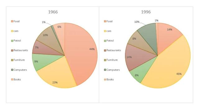
The given pie charts depict the patterns of expenditures between 1966 and 1996 in the United State.
In 1966, the most significant outlay was
food
which was almost half followed by Add an article
the food
cars
with a percentage of 23%. ,Next the secondary spending Use synonyms
such
as books, furniture, and computers were expending just under 10%. Even though Linking Words
cars
were bought massively in the period, petrol was the least expensive in the US.
Compared with 1996, Use synonyms
cars
purchase increased sharply to 45%, Use synonyms
in contrast
with staples as the most expenditure in the previous period, food dramatically decreased to 14%. Linking Words
Furthermore
, Petrol and Restaurants slightly rose during the period. The books dwindled to 1% and went to the Linking Words
last
position.
Linking Words
Overall
, during the years between 1966 and 1996, Americans spend their money on buying Linking Words
cars
which were the most, and it Use synonyms
also
rose Linking Words
petrol
expenditure. Change preposition
to petrol
While
books and food moderately declined.Linking Words