
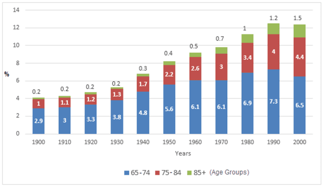
The given chart set out the proportion of over 65 years old people in the US population in the period from 1900 to 2000. In general, old people accounted for more and more percentage in the US population structure after a decade.
It can be seen from the graph that the number of US citizens aged 65 and over increased gradually from 4% in 1900 to 12.6% in 1990 before a slight decrease to 12.4% in 2000. The same trend was witnessed in the movement of the 65-74 years old group with a stable rise from 2.9% in 1990 before peaking at 1990 at 7.3%.
On the other hand
, 75-84 and over 85 groups shared a similar pattern which levelled in the early 1900s before a sharper increase from the mid-1900s to the end of the decade. To be more specific, the 75-84 group tripled from 0.5% in 1950 to 1.5% in 2000 Linking Words
while
the over-85 group doubled from 2.2% in 1950 to 4.4% in 2000.Linking Words