
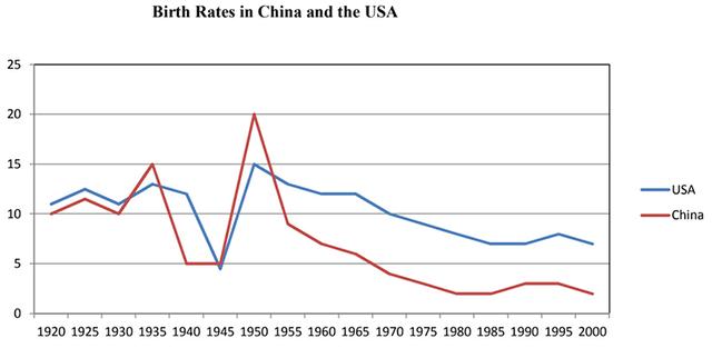
The line graph provides the proportions of births taking place in
China
and in the USA during an eight decades time frame going from 1920 to 2000.
Use synonyms
Overall
, it can be seen that Linking Words
although
, in 1920, both countries started with a similar number and both their rates decreased, the USA ended with greater rates.
About Linking Words
China
, after the initial scale of 10% in 1920, it fluctuated during the next 20 years until it levelled off at 5% in 1940.Use synonyms
Next,
the figure rose to its peak of 20% in 1950, and Linking Words
then
, after a dramatic drop in the following 5 years, it declined gradually throughout the next 45 years.
Linking Words
Similarly
, in the USA, the first analyzed data was just above Linking Words
China
, followed by a constant fluctuating trend interrupted Use synonyms
at the end
of 1940 by a five-year sharp decline. Just after that, the percentage recovered reaching its peak at 15% in the same year in which Linking Words
China
did it. At that point, it Use synonyms
finally
witnessed a steady fall.Linking Words