
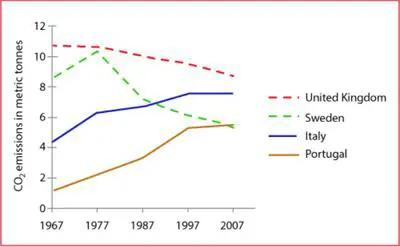
The graph illustrates the
carbon
dioxide emitted by the United Kingdom, Sweden, Italy, and Portugal between the years 1976 and 2007.
The United Kingdom and Sweden had the highest Use synonyms
carbon
Use synonyms
emission
at the start of 1976 which later decreased by the Use synonyms
end
of 2007. Meanwhile, Italy and Portugal showed a lower release of gas in 1976, which showed a notable increase by the Use synonyms
end
of the Use synonyms
year
2007.
The United Kingdom had a Use synonyms
carbon
Use synonyms
emission
of 11 metric Use synonyms
tons
in the Use synonyms
year
1967, which later showed a steady decrease to 7 metric Use synonyms
tons
by the Use synonyms
end
of the Use synonyms
year
2007. Use synonyms
While
Sweden was marked to release 9 metric Linking Words
tons
of Use synonyms
carbon
in the Use synonyms
year
1967, which increased to about 10 metric Use synonyms
tons
in 1977, and later showed a tremendous decline to approximately 5 metric Use synonyms
tons
by the Use synonyms
end
of 2007.
Use synonyms
Whereas
, Italy and Portugal show a similar trend, both these countries showed an elevation in Linking Words
carbon
Use synonyms
emission
between 1967 and 2007, from 4.5 to 7 metric Use synonyms
tons
and 1 to 5 metric Use synonyms
tons
respectively. Use synonyms
In addition
, both these countries maintained their Linking Words
emission
rate between the Use synonyms
year
1997 and 2007.Use synonyms