
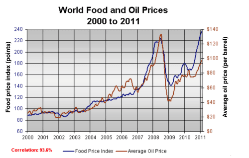
The line graph illustrates the variation in international feed and petrol costs between 2000 and 2011.
Overall
, in 2008, both of them reached their peak and the meal price index was measured by scores, Linking Words
however
, oil cost was counted in barrels. The food price index is given in a blue line, and the petrol cost is given in a red line.
Turning to the details, in 2000 the cooking price was 90 scores, Linking Words
then
it increased gradually between 2000 and 2006. After that, in 2007 and 2008 it raised fast, Linking Words
hence
it was a dramatic rise of 120 points. As you can see, in 2009 it declined sharply to 140 points. Linking Words
Then
it fluctuated between 2009 and 2010. After all of these difficulties, it reached its peak at point 240.
As described in the graph, there was a mini fluctuation between 2000 and 2003. Linking Words
Then
it grew steadily for two years. It can be clearly seen that it fluctuated again between 2005 and 2006. Linking Words
Then
it surged in 2008 and reached its peak at the point of 130 barrels. It is obvious that there was a sharp drop to 40 barrels. The graph reveals that it uplifted for 2 yearsLinking Words