
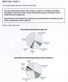
The pie chart illustrates the standard amount of energy utilized in houses in Australia.
Overall
, it is clearly visible from the pie chart that heating and cooling, water heating and other appliances use most of the power in an Australian household. Linking Words
Whereas
other areas of usage in apartments like standby, cooking, lighting, fridges and freezers consume less efficiency.
Linking Words
First,
the majority of the intensity used in heating and cooling accounted for 38% of the total usage in residence. Second, a fourth of the strength applied in water heating, standing at 25%. Linking Words
Moreover
, added together, these two categories made up more than half of all the power utilized in buildings.They accounted for the highest consumption with 63%.
Linking Words
On the other hand
, the utilization of efficiency with the lowest proportion was contributed in standby with 3% and for cooking accounted for 4% followed by lighting and fridges and freezers at 7% each respectively.Linking Words