
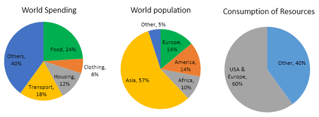
The given pie charts show data on food, clothing, housing, transport and
others
and consumption of Use synonyms
resources
by countries of the Use synonyms
world
and how the population is distributed.
The Use synonyms
world
spending on food is 24%. Next clothing is the lowest at 6%. Housing spending is 12% of 100%. Transport is 18% higher than housing. Use synonyms
In contrast
, Linking Words
others
Use synonyms
is
the highest at 40% of Change the verb form
are
world
spending.
Use synonyms
On the other hand
, Linking Words
Europe
's people is 14% the same as America's. Use synonyms
Furthermore
, Africa is lower than previous countries with 10% of the Linking Words
world
community. Asian becomes the highest at 57%. Use synonyms
In Addition
, other becomes the lowest with 5% citizens. USA and Linking Words
Europe
are the highest of using Use synonyms
resources
at 60% Use synonyms
while
the Linking Words
others
do not even use the half of Use synonyms
resources
at 40%.
Use synonyms
To sum up
, the spending of Linking Words
others
is the greatest of Use synonyms
world
spending and clothing is the lowest. The Use synonyms
world
population is dominated by Asian people and the same number is happening in Use synonyms
Europe
and Africa. Use synonyms
Europe
and USA are the top users of using Use synonyms
resources
.Use synonyms