
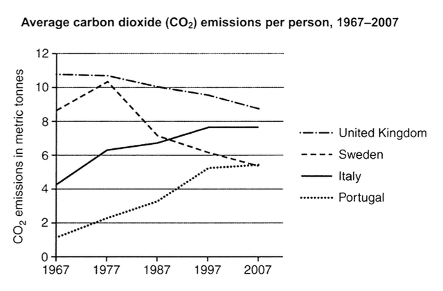
The line graph illustrates the average amount of
carbon
Use synonyms
dioxide
(CO2) discharged per Use synonyms
person
in the UK, Use synonyms
Sweden
, Italy, and Portugal from 1967 to 2007.
Use synonyms
Overall
,Linking Words
it is clear that
people in the UK and Linking Words
Sweden
had a downtown Use synonyms
trend
in Use synonyms
carbon
Use synonyms
dioxide
(co2) Use synonyms
emissions
,Use synonyms
while
the average Linking Words
carbon
Use synonyms
dioxide
(co2) Use synonyms
emissions
in Italy and Portugal showed an upward Use synonyms
trend
over the past five decades.
Looking at the graph more closely, one can see that average Use synonyms
carbon
Use synonyms
dioxide
(co2) Use synonyms
emissions
in the UK remained almost constant during the first 10 years,representing nearly 11 metric Use synonyms
tons
, and gradually dropped down to around 7 metric Use synonyms
tons
per Use synonyms
person
in the year 2007.In the meantime, the increasing Use synonyms
trend
in Use synonyms
carbon
Use synonyms
dioxide
(co2) discharged By people,showing the peak emission volume at over 10 metric Use synonyms
tons
per Use synonyms
person
, stopped in 1977,Use synonyms
then
fell in the following years.
Linking Words
On the contrary
,the upward Linking Words
trend
in the average Use synonyms
carbon
Use synonyms
dioxide
(co2) Use synonyms
emissions
in Italy overtook the emission rate in Use synonyms
Sweden
after the year 1987.In 1997 ,it reached approximately 7.5 metric Use synonyms
tons
per Use synonyms
person
and remain the same afterwards.In Portugal,the average Use synonyms
carbon
Use synonyms
dioxide
co2 Use synonyms
emissions
first started lower than 2 metric Use synonyms
tons
per Use synonyms
person
,In 2017 ,it dramatically increased until hit the same amount of co2 discharge in Use synonyms
Sweden
.
.Use synonyms