
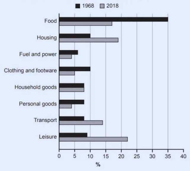
The given chart depicts percentages of families in one country
spent
their weekly income in two different years.
Correct pronoun usage
who spent
Overall
, in 1968 they spent their income on food which was the largest compared to other demands. The lowest spending was Linking Words
Fuel
and power. Use synonyms
In contrast
, in 2018 the biggest spending was on Leisure and the lowest spending was on Linking Words
fuel
and power, and personal goods.
In 1986 food spending was higher than in 2018, in 1968 it was 35% and in 2018 it was 17%. Housing consumed 10% in 1986 and rose in 2018 to 18%. In 1986 Use synonyms
fuel
and power were higher than in 2018, in 1986, Use synonyms
fuel
was 10%, and in 2018 decreased to 4%. Clothing and footwear were higher in 1968 by 10% compared to 2018 at 5%. In 50 years, the average spending on household goods experienced no changes at 8%. Use synonyms
However
, Personal goods in 1968 were 8% and fell to 4% in 2018. In 2018, transport increased to 14%, more than before at 8% in 1968. Linking Words
Moreover
, Leisure spending was higher in 2018 at 23% than 50 years before at 9%.Linking Words