
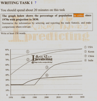
The line chart given illustrates the proportion of the urban population from the 1970s to the 2030s.
It is obvious between 1970 and 1990,
while
America rose slightly from 70% to exceed 80%, Korea climbed dramatically from 40% to just roughly 75%. Linking Words
After
Linking Words
this
, the period of 1990 and 2030, in comparison with the USA, which stepped up slowly to approximately 85% in 2000 and could peak at 90% in 2030, Korea surged significantly to about 85% in 2000 and would have a peak at 90% in 2030.
As can be seen by 1970, apply China started from 20% to grow steadily to 30% in 1990 respectively, and India stood at 20% and have stable in 1990. Linking Words
The following step is
that in 2000, China increased moderately to over 30% in 2000 and would be nearly 40% in 2030, constituting India, which soar substantially to generally 50% in 2000 and would peak at relatively 70% in 2030.Linking Words