
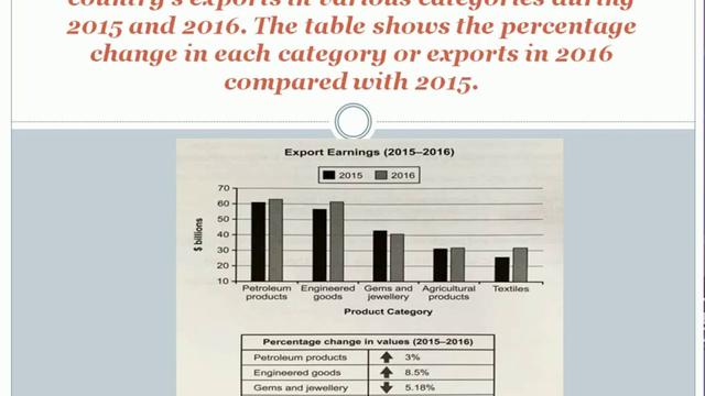
The given bar chart illustrates the export earnings of one country between 2015 and 2016
while
the table provides information about the changes in their value.
From an Linking Words
overall
perspective, it can be seen that petroleum products had the highest rate Linking Words
whereas
textiles experienced the biggest increase. And all of the graphs climbed except the hems and jewellery one.
To delve deeper into the data, petroleum exports rose slightly by exactly 3% to reach just below 65 Linking Words
billion
dollars. Engineering goods Use synonyms
also
had high figures and its goods increased by 8,5% to over 80 Linking Words
billion
dollars in 2016. Jems and jewellery is the sole figure which dropped by 5,18% and accounted for roughly 40 Use synonyms
billion
in the second year. Agricultural products remained relatively the same with a slight increase below 1% Use synonyms
while
textiles figures saw an upward trend with more than 15% to even exceed 30 Linking Words
billion
dollars in earnings.Use synonyms