
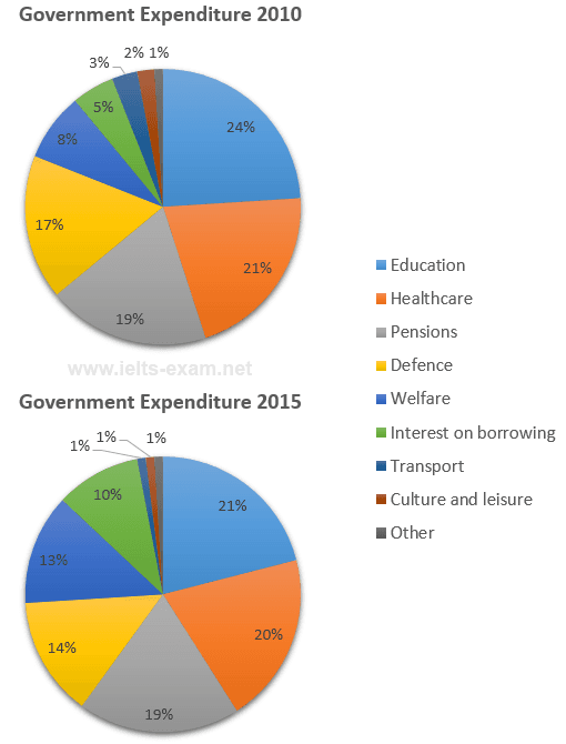
The given pie charts illustrate various expenses made by local government in different fields in the years 2000 and 2010.
Overall
, it is clear from the data that in both periods education was the one with the highest segment and the other with the least. Linking Words
Moreover
, interest and borrowing have shown a slight increase when compared to 2015 and there were no noticeable changes in other segments.
The Educational sector accounted for 24% in 2010 but decreased by 3% in 2015.when coming to the healthcare sector it was 21% and in 2015 it showed a slight decrease of 1%.Linking Words
However
, at the beginning defence was having 17% of expenses but Linking Words
at the end
, it decreases to 14%.Linking Words
Apart from
Linking Words
this
, other sectors like transport, culture and leisure showed 3% and 2% in 2010 but decreased by 1%.
Welfare was only 8% in the starting period but Linking Words
initially
, it rose to 13%.In 2010 interest on borrowings was only 5% but in the end, it increased by 5%.Linking Words
while
pensions remained the same.Linking Words