
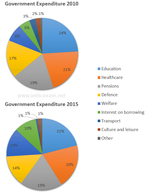
The given pie charts describe changes amongst rival government expenditures which are 9 departments in the
years
2000 and 2010.
Use synonyms
Overall
, there were some small changes in some groups Linking Words
although
not a major difference between these certain Linking Words
years
. with the exception of the Internet on borrowing and welfare, had slightly increased percentage but, Transport had decreased.
specifically looking at the popularity in both Use synonyms
years
. First of all, Education was the most popular 24% and 21%, Use synonyms
Linking Words
however
decreased Add the comma(s)
,however
by3
% When coming to Healthcare 21%, 20% and Pensions 19% respectively in both Correct your spelling
by 3
years
. These were steadily going on for over 5 Use synonyms
years
. Use synonyms
In addition
, the Internet on borrowing had grown up from 8% to 13% in 2015. Linking Words
Secondly
, Linking Words
While
some industries had been expanding, Transport had slightly gone down from 3% to 1% unfortunately. ,Linking Words
Also
culture and leisure and others had not much improvement because they only had 1% in certain Linking Words
years
.Use synonyms