
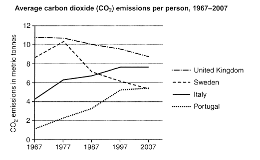
The line chart indicates the mean emission of carbon monoxide (C02) per individual in four different countries (United Kingdom, Sweden, Italy, and Portugal) from 1967 to 2007.
It can be seen that the United Kingdom's co2 discharge was the highest among other countries in the given
period
. Use synonyms
In addition
, Italy and Portugal witnessed a noticeable increase.
In 1967, the amount of carbon monoxide emitted in Italy and Portugal was approximately four and one metric Linking Words
tonnes
respectively. These two countries rose significantly from the beginning until the end of the Use synonyms
period
. In 2007, Italy reached its top emission nearly eight metric Use synonyms
tonnes
. Use synonyms
Furthermore
, individual co2 discharge peaked at almost 5.5 metric Linking Words
tonnes
in 2007.
More than eight metric Use synonyms
tonnes
of co2 were emitted by individuals in Sweden in 1967 before steadily climbing to over ten metric Use synonyms
tonnes
in 1977. Above that year, the number of emissions dropped dramatically almost half its peak Use synonyms
at the end
of the Linking Words
period
. Use synonyms
Additionally
, the United Kingdom Linking Words
also
experienced a gradual decline in the given Linking Words
period
.Use synonyms