
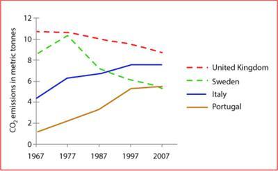
The line graph compares the different average emissions individually in the
UK
, Use synonyms
Sweden
, Italy and Portugal from 1967 to 2007
Use synonyms
Overall
, over 40 years the United Kingdom has the highest peak, Linking Words
whereas
Portugal is the least of all the given countries.
Linking Words
To begin
with, in 1967, the Linking Words
UK
averages up to 11 Use synonyms
tonnes
of discharge. Use synonyms
In contrast
, Linking Words
Sweden
is second averaging over 8%. Italy only consists of 4 Use synonyms
tonnes
and Portugal is the lowest, slumped below 2%. It is noticeable that in the next 3 decades which is the year 2007, Italy and Portugal constantly escalates in Use synonyms
tonnes
with the emission of 7% and 5%. Use synonyms
However
, Linking Words
Sweden
experienced mountains and valleys in which Use synonyms
Sweden
and Portugal nearly meet in Use synonyms
tonnes
yet Portugal is more least. Use synonyms
On the other hand
, the Linking Words
UK
drastically collapsed below 10% in the emission of CO2.
To summarize, still, the Use synonyms
UK
has the highest CO2 emission rate even though it decreased over time and Portugal remains the lowest.Use synonyms