
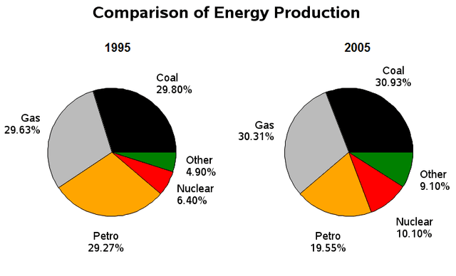
The two pie charts illustrate the proportion of power from several sources from 1995 to 2005, measured in percentages.
Overall
, it is noticeable that the output was dominant from gas, coal, and Linking Words
petro
, Correct your spelling
petrol
while
other categories showed the opposite.
Linking Words
According to
the data, the Linking Words
production
of energy was high from gas, coal, and petrol in both years. Stood at just below 30% in 1995, the amount of gas increased to more than 30% in 2005, slightly lower than coal Use synonyms
production
in that year. Use synonyms
Further
, followed by petroleum, which accounted for just above 29%, before decreasing to around 19% in 2005. For coal output, the number of Linking Words
production
had increased from 29.80% to nearly 31% in 2005.
Turning to other categories, nuclear and other non-specified Use synonyms
production
showed the least output contribution. Nuclear was merely at 6.40% and increased to more than one in ten in 2005, Use synonyms
while
for other energy only about 5% Linking Words
then
rose to 9.10% in 2005, more than two times higher in 2005.Linking Words