
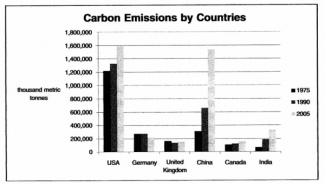
The bar chart demonstrates greenhouse gasses released in multiple areas throughout three separate years. From an
overall
perspective, it is readily apparent that some countries produce more carbon than othersLinking Words
,
and some that have mostly stayed identical through the years.
To start, it is visible that in 1975, most countries other than the USA started at almost an even number, Remove the comma
apply
however
, Germany and the United Kingdom’s amount lowered Linking Words
while
all the others increased. Linking Words
Furthermore
, the expansion of the gas emission was more exponential in China and the USA, Linking Words
while
India and Canada had a more slow journey of approximately two hundred thousand.
Linking Words
In addition
, The USA was dissimilar to all the other areas since its number was already high at the start and ended at an even larger number of four hundred thousand more than its start. China was Linking Words
also
part of the group since it had the fastest enlargement of around tripling its count every 15 years.Linking Words