
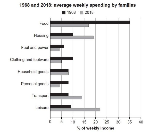
The graph given illustrates the families' weekly expenses in eight categories based on their salaries in a country from 1968 to 2018.
Overall
, people spent the most on food in the past to the point it dominated almost half of their income. Linking Words
However
, society’s spending preference shifted to other choices in the future.
Back Linking Words
then
in 1968, it was obvious that food became the priority, as 35% of the families' earnings was spent on their meals. Linking Words
In contrast
, the Linking Words
behavior
changed after 40 years as the proportion of weekly income used for food went south to approximately 17%.
Looking at the detail component of the chart Change the spelling
behaviour
such
as housing, transport, and leisure, they became the categories that families paid more attention to in the present. People back Linking Words
then
used 10% of their earnings for housing necessities, around 8% for transportation, and almost 10 % for leisure, Linking Words
then
four decades later the number multiplied to half and even more.
Linking Words
However
, there are Linking Words
also
some aspects where people used to spend more in 1986 and the habit shifted to spending less in 2018. Linking Words
For instance
, the money used to pay for fuel and power, clothing and footwear, and Linking Words
also
personal goods, decreased after forty years. It went from more than 5%, 10%, and approximately 8% respectively to less than half of the percentage. Linking Words
However
, only household goods remained the same for four decades.Linking Words