
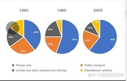
The charts present the percentage of four sorts of transportation means utilized in England in 1985, 1996 and 2005.
Overall
, among all four types, private cars have taken the lead in all three given times. Linking Words
On the contrary
, recreational vehicles occupied the least usage.
Over the course of time, the per cent of private cars used witnessed an increase. In the initial 20 years, it dramatically rocketed from 40% to 55%, followed by a slight rose to 60% in 2005. Linking Words
In contrast
, lorries and other cars are used less as time goes by. In 1965 and 1985, the percentage of that type of vehicle stabilized at 20%, Linking Words
then
significantly plummeted to 10% in 2005.
Recreational vehicles and public transport shared an identical trend, which is fluctuating. Between 1965 and 1985. Their per cent of being used gradually fell, from 15% to 5% and 25% to 20% respectively. In 2005, Recreational vehicles minimally climbed up to 8%, whilst public transport slowly escalated to 22%Linking Words