
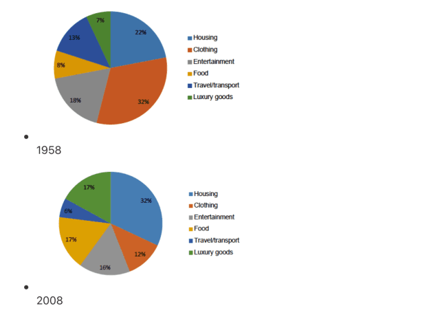
The given pie charts illustrate the percentage of personal expenditures in an accurate country in Europe, divided into different categories over a period of 50 years, in 1958 and 2008.
Overall
, Linking Words
it is clear that
during the period, there are significant changes in customers’ demands for commodities and services. Linking Words
While
caterings were vital in 1958, the trend seemingly reversed till 2008, as more and more housing and luxury goods were sold to gratify the masses’ needs.
As is represented, in 1958, people spent the largest proportion of their expenditures on food, at 32%. The second-highest ratio belonged to spending on housing, at approximately 22%. Other categories Linking Words
such
as clothing and Linking Words
entertainment
remained at a moderate percentage, specifically 18% of the community’s spending was used for clothing, and 13% for Use synonyms
entertainment
.
In 2008, people’s spending in all aspects had particular changes. The need for housing, travelling and luxury items dramatically rose over time. Use synonyms
For example
, houses and transportation demands each accounted for 32% and 17%, much more significantly contrary to results in 1958. Noticeably, there were fewer and fewer people spent on food and Linking Words
entertainment
, as the ratio of catering and Use synonyms
entertainment
sharply declined to 12% and 6% respectively. Interestingly, the expenditure on clothing didn’t change much during the period of 50 years, remaining at 16% to 18%.Use synonyms