The bar charts and line graph below show the results of a survey conducted over a three-year period to discover what people who live in London think of the city. Summarize the information by selecting and reporting the main features, and make comparisons where relevant. You should write at least 150 words.

The bar charts and line graph below show the results of a survey conducted over a three-year period to discover what people who live in London think of the city. 

Summarize the information by selecting and reporting the main features, and make comparisons where relevant. 

You should write at least 150 words.
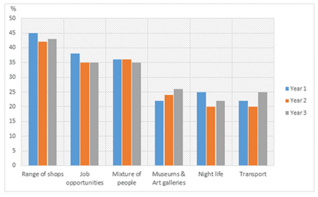
The two bar charts are rating things about living in London, from the most popular to the least popular one,
while
the line graph deal with the major problems in the UK in a three years period.
Overall
, society's perception of the worst and the best things about living in London has not changed much over the given period. Residents believe that the biggest problem in their city is litter.
Firstly
,
according to
the graph ,
while
more than 40% of the community enjoy the wide variety of shops ,and over 20% love London's nightlife,more than 47% of residents complain about the cost of living, meanwhile some individuals consider UK transport one of the best things, more than 26 % consider it to be one of the worst aspects over the three years period.
Secondly
,the line graph shows a steady decline in the percentage of people worrying about air quality and noise pollution ,from nearly 60% to over 54%. More and more people start concerned about litter between the first years ,but
then
this
percentage declined symmetrically.
Submitted by zaineajessica on

Unauthorized use and/or duplication of this material without express and written permission from this site’s author and/or owner is strictly prohibited. Excerpts and links may be used, provided that full and clear credit is given to Writing9 with appropriate and specific direction to the original content.

Sentences: Add more complex sentences.
Linking words: Don't use the same linking words: "while".
Introduction: The introduction is missing.
Introduction: Change the first sentence in the introduction.
Introduction: The chart intro is missing.
Vocabulary: The word "graph" was used 3 times.
Vocabulary: The word "percentage" was used 2 times.
Vocabulary: The word "decline" was used 2 times.
Vocabulary: The word "about" was used 5 times.
What to do next:
Look at other essays: