
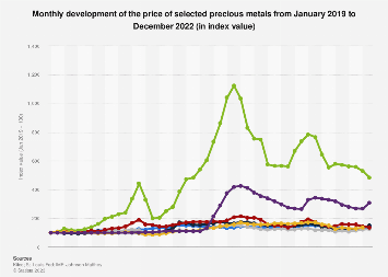
The display
line
graph describes the average closing of valuable metals from 2013 to 2021. Monthly development of the price of selected precious metals from January 2019 to December 2022. The below data describe the given graph.
Use synonyms
Firstly
, In the green Linking Words
line
increase and Use synonyms
then
decrease to 5. In purple, the Linking Words
line
increases Use synonyms
then
decreases a little up to 6. In The red Linking Words
line
increasing a little bit only nearly 6. The yellow Use synonyms
line
is different a little bit near 6. The blue is increasing. The green Use synonyms
line
is grown too much compared to other Use synonyms
lines
. There are 5 Use synonyms
lines
with the colour green, blue, yellow, purple and red. The data is given in index value about the Use synonyms
lines
.
Use synonyms
To conclude
, the above information describes the given diagrams. The data is from January 2019 to December 2022. The above information gives a brief idea about the 5 Linking Words
lines
in the table.Use synonyms