
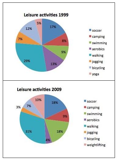
The charts explain the popularity of leisure activities
according to
a survey in the US Linking Words
across
1999 and 2009.
Generally speaking, what stands out from the charts is that walking was the most popular work in leisure time each year. Change preposition
between
However
, in 1999 yoga and in 2009 jogging was the least popular choices.
In 1999, walking accounts for 29%, which was 12% more than soccer and 16% more than aerobics. Yoga and jogging, Linking Words
on the other hand
, had the two smallest proportions of leisure activities with 5% and 7% respectively. Linking Words
Additionally
, camping and bicycling were responsible for 8% and 12% respectively.
Focusing on 2009, walking again had the greatest contribution with 31%, after that soccer and swimming raised by 1% and 9% in 1999 respectively and took 18% of total activities. Linking Words
In contrast
, aerobics fell from 13% to 4% , which was the second smallest percentage Linking Words
this
year. Linking Words
Similarly
, jogging faced Linking Words
such
a downfall trend and declined by 4%.Linking Words