
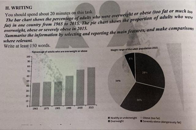
The given column graph compares the
percentage
of mature that were overweight in one country between 1965 and 2015, Use synonyms
while
the pie chart illustrates the weight range of Linking Words
adult
proportion in 2015.
Fix the agreement mistake
adults
Overall
, the Linking Words
percentage
of adults that Use synonyms
had
overweight increased from 1985 to 2005, Verb problem
were
also
in 2015 most of the adults were obese and overweight.
It can be seen from the graph, Linking Words
the
Correct word choice
that the
percentage
of increase in overweight was a very small number during the 20 years. After that, Use synonyms
this
Linking Words
percentage
began to rise steadily and reached about 70% in 2005. Use synonyms
Then
, the Linking Words
percentage
of increase was slightly about approximately three quarters in 2005.
The pie chart had 4 different categories for the adult population and one of the biggest percentages was obese, at 34%, in comparison with 31% in overweight. Use synonyms
Additionally
, Linking Words
while
healthy and underweight with 29%. Linking Words
Although
the lowest Linking Words
percentage
was severely obese or dangerously fat with 6%.Use synonyms