
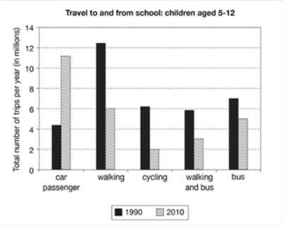
The pie chart illustrates how many trips were made by children to get to and from school using different modes of transport in 1990 and 2010. The essay will give an overview, and
then
discuss both years, one after another.
Linking Words
Overall
, the most popular way for children aged from 5 to 12 in 1990 to get to school was by walking, Linking Words
whereas
in 2010 it was being a car passenger. The least favoured mode of transport in 1990 was a personal vehicle, and in 2010 it was cycling.
In 1990, the most liked way to travel to school was walking, totalling up to Linking Words
12,5
m annual trips, followed by the usage of buses for 7m travels. Cycling and a combination of walking and bus showed really close numbers, 6,1 and 5,9m journeys, respectively. The number of travels by the least popular mode of transportation, which was an automobile, was scarcely 4,3 million.
In 2010, the most admired way was being driven by an automobile, making up to 13,2 million tours, Correct your spelling
12.5
while
the least favourable one only totalled 2 million. The second most favoured mode was walking, with 6m trips, followed by the bus, with 5m, and the compound of bus and walking, with 3m.Linking Words