
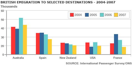
The chart below represents information about British emigration to different countries from 2004 to 2007.
Looking from an
overall
perspective, it could be seen that people most prefer Australia for emigration. Australia was a leader Linking Words
of
emigration for all these four years from 2004 to 2007.
In detail, talking about Australi in all years apart of 2005 Change preposition
in
Use synonyms
proportion
of emigrates was higher than 40%. Correct article usage
the proportion
However
, in 2005 the Linking Words
proportion
was a little bit lower around 38%.
Spain is the second largest country of emigrants after Australia. In 2004 and 2005 the percentage of emigrants was almost the same nearly 35 percent. Use synonyms
Nevertheless
, after 2005 the Linking Words
numbers
slightly decrease and in 2006 it reached around 33%. The Use synonyms
numbers
continued to fall and in 2007 reached 28 Use synonyms
percent
.
The Change the spelling
per cent
proportion
of New Zealand represents Use synonyms
downtrend
. In 2004 Add an article
a downtrend
Use synonyms
numbers
were 25% and in 2007 it was 20%. Correct article usage
the numbers
Number
of people who moved to the USA showed the same Change the article
A number
The number
proportion
in 2004 and 2006 25 % Use synonyms
as well as
in 2005 and 2007 20%. France's chart was the most active. In 2004 the Linking Words
proportion
of people who decided to move to France was around 24 percent. Use synonyms
In contrast
, Linking Words
after
Linking Words
this
year the number gradually increased and reached 34%. Linking Words
While
, after Linking Words
folowing
year Correct your spelling
following
numbers
started to go down and in 2007 reached 18%.Use synonyms