
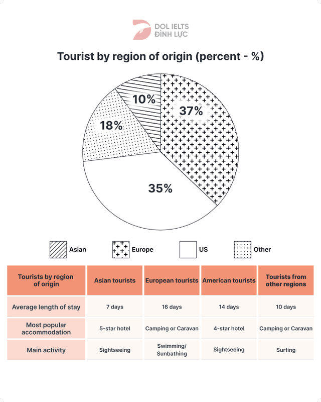
The pie chart and data from the table describe the number of
tourists
in Use synonyms
Australia
by origin and several categories. The data from the diagram is presented in percentages. In general, most foreign visitors are dominated by people from Asia. Use synonyms
While
European Linking Words
tourists
spent the longest day in Use synonyms
Australia
compared to others.
From the pie chart, we can see the original tourist region that came to Use synonyms
Australia
. Use synonyms
Firstly
, Asia has the biggest proportion at 37%. Linking Words
Secondly
, the European tourist portion has only a slight difference compared to Linking Words
Asia'
at 35%. Change noun form
Asia
Thirdly
, visitors from the US only 18% and the rest 10% came from other regions.
Looking at the information from the table, in terms of a place to stay, Asian people prefer to stay at 5-star hotels. It is quite similar to American Linking Words
tourists
, they choose 4-star hotels as their Use synonyms
favorite
accommodation. Change the spelling
favourite
On the other hand
, European Linking Words
tourists
and visitors from other countries prefer to choose camping or caravan Use synonyms
while
staying in Linking Words
Australia
.Use synonyms