
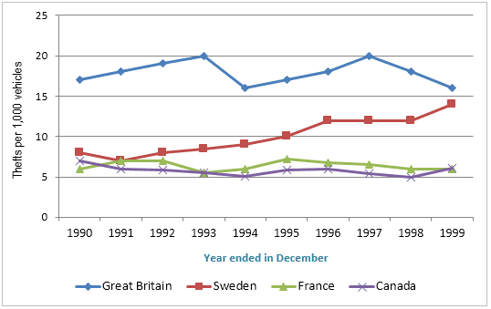
The given line chart illustrates how many cars were stolen in four countries: the UK, Sweden, France, and Canada from 1990 to 1999.
Overall
, what stands out from the figure is that Linking Words
while
Great Britain's rate of crime was the highest, the graph for the other three countries was significantly lower. Linking Words
However
, the number for Sweden had risen considerably within that time.
Focusing on Great Britain and France, the former began the period by having the highest crime rate in car thefts with approximately 18 in 1990 and there were some fluctuations during the time to drop under 16.5 Linking Words
at the end
of 1999. The latter, France, faced some ups and downs but it stayed at the same levels at 6.5 per 1000 vehicles during the decade.
Linking Words
On the other hand
, surprisingly, the number of car thefts in Sweden increased sharply over time. Linking Words
while
it was only nearly 10 thefts per thousand vehicles in 1990, Linking Words
then
it rocketed to 14 in 1999. Linking Words
In contrast
, Canada started at 5.5 in 1990, fell to 5 after 3 years, and Linking Words
thereafter
grew steadily to 5.3 after 6 years in 1999.Linking Words