
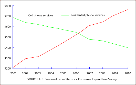
This
line chart depicts the yearly average consumption of Linking Words
cell
phones and residential Use synonyms
phone
Use synonyms
services
in the United States from 2001 to 2010. It is clear from the graph that, the utilization of Use synonyms
cell
Use synonyms
phone
Use synonyms
services
rocketed bast in the Use synonyms
last
ten years.
Linking Words
According to
what is shown, the consumption of the residential Linking Words
phone
in the first period was less than 700$ and decreased slightly to around 550 dollars in 2006 and become at the same point as Use synonyms
cell
phones, but did not stop at Use synonyms
this
range, it continued to dip until become 400$ Linking Words
at the end
of the period.
In terms of Linking Words
cell
phones, it was about 210$ in 2001 and started to grow gradually to about 770$ in 2010.
Use synonyms
To sum up
, we could say that, there was a huge gap in the expenditure between Linking Words
cell
Use synonyms
phone
Use synonyms
services
and residential Use synonyms
phone
Use synonyms
services
at the beginning of the interval and Use synonyms
also
Linking Words
at the end
of the year.Linking Words